Three New Ways to Personalize Your iPhone’s Home Screen in iOS 18
With the launch of iOS 18, Apple is taking iPhone customization to a new level. Before, you could easily add widgets to your Home Screen or rearrange its pages, apply your own wallpaper, and customize your Lock Screen. Meanwhile, power users downloaded apps that allowed them to customize their icons using iOS Shortcuts or even created their own icons using design tools or images from Pinterest or Google.
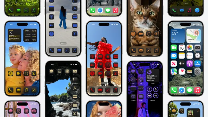
With iOS 18, the ability to change all your icons to a new color scheme is a built-in tool. You can arrange your icons and widgets as you prefer. They no longer have to be next to each other in a grid. This means you could frame your wallpaper or place icons only at the bottom, for instance.
Though the customization system has gotten somewhat complex, iOS 18 offers the most control over your iPhone’s user interface than any previous version. Now, by pressing and holding your iPhone’s Home Screen, you can tap the upper-left “Edit” button to enter the new customization mode. From here, you’ll add widgets, edit Home Screen pages, or select “Customize” to configure the color and shading of your icons and widgets.
iOS 18 presents four options for your icons: standard light, dark modes, an Automatic mode that shifts from light to dark, and the new “Tinted” option. When selected, Tinted lets you use the eyedropper tool (upper-right) to pick a color from your Home Screen’s background that tints the fill for the lighter part of your icons.
For example, if your wallpaper features a photo from nature, you could pick the blue sky’s color to tint your icons. You can adjust color options using two sliders: one for shade and another for saturation. (Sliding it all the way to white makes the tint less apparent.)
This process can be somewhat difficult, and there’s been criticism, particularly from designers, about how the resulting Home Screen looks. It doesn’t feel like Apple’s elevated design sense, but that’s the point: It’s your own.
The feature caters specifically to younger users who quickly took advantage of new options in iOS 14 to personalize their Home Screens with custom icons and widgets. Pinterest adoption soared at that time, as young people turned to it for images to use as custom icons and themes. Apple quickly responded to this interest by changing how custom icons behave. Instead of briefly opening the iOS Shortcuts app, it introduced a small pop-up when the app opened via a custom icon.
But until now, Apple hasn’t allowed users to customize their apps’ existing icons with shades and colors of their choosing. While you still can’t change the design of the icon’s image itself (without using your own shortcuts), developers can ship alternative icons as part of their app download. These icons may be offered as part of a paid upgrade or subscription, depending on the developer. Not all apps offer alternative icons.
After choosing the icon you prefer from apps that offer alternatives, you can select how you want them to appear: light, dark, or tinted. Dark icons give the Home Screen a different look, as they maintain some colors but sit on black backgrounds, allowing more focus on the wallpaper. Tinted icons are similar, but instead of multiple colors, their lighter parts are shaded with a color of your choosing.
Like many others, I didn’t find the dark icons with their odd splashes of color agreeable, and the tinted icons don’t quite fit my tastes — though that’s more personal preference. However, I found a way to create a Home Screen with more muted shades.
To accomplish this, I toggled the option from “Small” to “Large” in customization mode, which makes icons slightly larger and removes their text label. Widgets’ labels are also removed when you shift to Large icons. I then selected the option for tinted icons, slid the bottom slider to the right for less saturation, and tapped the sunshine option in the top-left of the customization window to switch from dark mode to light. This creates a brighter, more uniform look where icons appear in shades of black, white, and gray instead of the garish colors they usually are.
If you seek an even more minimalist Home Screen, iOS 18 lets you forgo icons altogether. One top customization app, Widgetsmith, has been updated for iOS 18 to take advantage of new functionality around large, label-less widgets to customize your Home Screen with Actions. These Actions can also be used via the Control Center (accessed by swiping down from the top of the screen) and offer shortcuts to play a favorite album or call a best friend, among other things.
Control Center aside, Widgetsmith includes various Home Screen widgets featuring rows of customized icons, each linked to a particular action. Without widget labels, these blend more seamlessly into your Home Screen, allowing for a more minimal — or at least more uniform — look, where every icon is in the same style.
The app ships with various icon packs to customize actions, or you can choose your own or use any SF symbol designed to integrate with the system font for Apple’s platforms.
“The aesthetics now possible in iOS 18 are really transformative to how your home screen feels,” says Widgetsmith’s developer, David Smith. “Since Apple drops the requirement for widgets to have their subtitles, you can completely take over your iPhone and make all of it your own.”
However, the more interesting idea Widgetsmith introduces is a Home Screen without icons. Instead, you can install widgets that spell out text for various apps like Weather, Mail, Maps, Music, and Calendar. You can use these alone or alongside other widgets. You could even remove all icons from your bottom dock for a less cluttered look.
Widgetsmith isn’t the only app that offers this functionality, but it’s among the best-known. Another app focused specifically on minimalist Home Screens is Dumb Phone, which refers to a simple user interface from the days before smartphones. With Dumb Phone, you can create a similar minimalist Home Screen and adjust the theme to Light or Dark. The app’s developer, Michael Tigas, claims the changes helped him cut down on screen time.
Using icon placement to complement your wallpaper is another interesting idea from the new ability to place icons anywhere in iOS 18. Icons can become a part of your theme and wallpaper, blending into the illustration in ways they couldn’t before.
One app taking advantage of this functionality is Themify, a customization utility that includes themes “inspired by iOS 18.” Here, you’ll find themes where icons become part of the background, like one where icons in Large mode become planets in a solar system, or another where small icons resemble wall décor. Themify also supports other iOS features like Lock Screen widgets, themes, contact posters, standby screens, and more.
Other personalization apps I’ve used include Brass, Aesthetic, Aesthetic Kit, Best Widgets, Color Themes, Reskin, ThemeKit, ThemePack, Widgy, and Wallaroo for wallpapers.
Customizing your Home Screen is just one of the new personalization options that come with iOS 18. You can now swap out app shortcuts on your Lock Screen, organize your Control Center, and add actions from third-party apps if developers support it. You can also customize the layout, grouping, and size of controls, Apple notes.